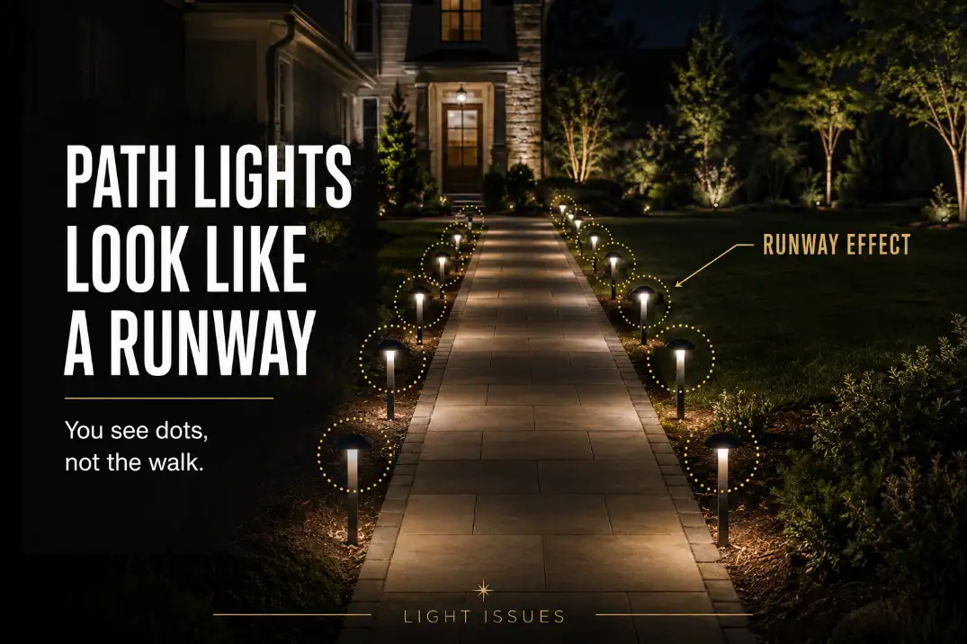
Path lights look like a runway when the fixture pattern becomes easier to read than the walking surface.
The usual cause is not simply “too many lights.” It is a repeated rhythm: straight-line placement, identical spacing, visible lamp heads, and light pools that repeat every 4–6 feet with no visual break.
Start with the most useful distinction. If the lights near the transformer are stronger than the lights at the far end, check voltage loss or wiring layout first.
If every fixture is equally obvious and the whole path looks overmarked, the problem is more likely spacing, glare, symmetry, or fixture style.
A good path should feel softly guided from 20–40 feet away. A runway-like path makes you count the lights before you notice where to walk.
Why the Pattern Takes Over
The lights become the main subject
At night, the eye notices repetition quickly. When path lights sit in a straight row with equal spacing, they stop acting like quiet guidance and start acting like markers.
The walking surface may be lit, but the stronger visual message becomes dot, dot, dot, dot.
That is why adding more path lights often disappoints. Extra fixtures may fill dark gaps, but they also tighten the visual rhythm.
If the path already has hard bright circles between darker areas, the issue may overlap with Outdoor Lights Create Bright Spots and Dark Gaps, not just a simple fixture-count problem.
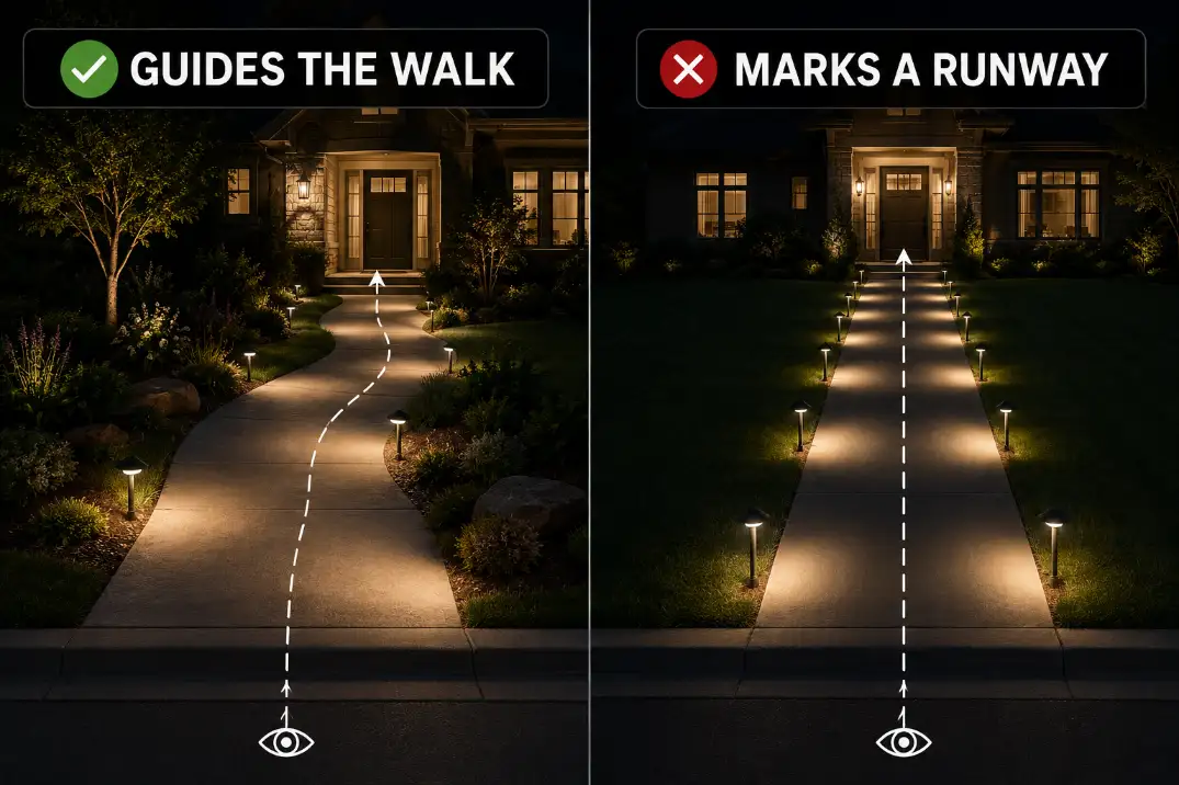
Opposite pairs make the path feel formal fast
Path lights placed directly across from each other can work on wide, formal entries. On a normal 3–4 foot residential walkway, they often look too rigid. Each pair creates a visual gate.
Repeat that five or six times and the path starts to feel marked instead of softly lit.
Staggered placement is usually more forgiving. It still guides movement, but it avoids the hard checkpoint rhythm that paired lights create.
Quick Diagnostic Checklist
- You notice individual light heads before you notice the path.
- Fixtures are evenly spaced every 4–6 feet along a straight walk.
- Lights are paired directly across from each other.
- The glowing lens is visible from 20–30 feet away.
- Each fixture creates a hard circle instead of a soft spread.
- The path looks harsher after your eyes adjust for 10–15 minutes.
- Brighter bulbs made the entry look more dramatic, not easier to walk.
The practical threshold is simple: if the light pattern is more visible than the walking route from the street, driveway, or front door, the layout is doing too much visual work.
What People Usually Misread First
Brightness is not always the main problem
Brightness matters, but it is rarely the whole cause. A modest 100-lumen path light can look harsh if it sits in a rigid line with an exposed source.
A better-shielded fixture with similar output can feel calmer because the light lands on the ground instead of shining toward the viewer.
People often overestimate how much brightness a path needs. On a narrow walkway, the goal is low-level navigation, not full edge-to-edge flood coverage. Once every fixture becomes a separate visible object, more output only sharpens the pattern.
Small-source glare is easy to miss
Small fixtures can still create glare. A tiny exposed LED under a cap can pull attention away from the walkway, especially from a porch step, sloped driveway, or front sidewalk approach.
That is why a path can look harsh even when the yard does not feel especially bright. The symptom is a row of bright points.
The mechanism is source visibility. If the uncomfortable part is the lamp itself instead of the lit ground, the issue connects more closely to Why Outdoor Lights Create Glare than to brightness alone.
Pro Tip: Judge the path from the direction guests actually arrive. A layout that looks fine from the lawn can look stiff from the sidewalk.
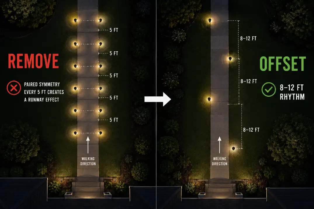
The Spacing Rule Is Not One Number
Tight spacing works only in the right context
Simple spacing rules can be useful, but they are not universal. Spacing around 6–8 feet can work on short paths, curved walks, steps, or areas with frequent direction changes.
In those places, the layout has natural interruptions, so the eye does not read the lights as one long row.
On a long, straight walkway, that same 6-foot rhythm can feel mechanical. The lights may be technically even, but visually they create a repeated pattern with no relief.
Wider spacing often looks more residential
For many straight residential walks, 8–12 feet between fixtures is a calmer starting point than tight, equal spacing. That does not mean every path should follow a fixed 10-foot rule.
It means the path should be lit by decisions: turns, steps, edges, surface changes, and entry transitions.
A straight 30-foot walkway may not need six fixtures. It may look better with three or four well-placed lights, especially if porch lights, garage lights, or street lighting already provide some ambient light.
The Better Fix Is Less Symmetry
Stagger the rhythm
The best correction is not random placement. Random lights can look messy and leave important walking zones underlit.
The better move is controlled irregularity: skip unnecessary fixtures, stagger sides, and let some light pools overlap while leaving calmer stretches between them.
If both sides of the path need lighting, avoid placing fixtures directly opposite each other. A left-right-left rhythm feels more natural than paired lights every few feet.
Pull fixtures off the edge
Fixture setback is easy to overlook. Lights placed right on the walkway edge can make the path read like a marked lane. Pulling fixtures about 12–24 inches into a planting bed softens the line and lets the light feel like part of the landscape instead of a boundary stripe.
This matters most on narrow paths. On a 3-foot walkway, edge-hugging fixtures can feel visually crowded even when the spacing looks reasonable on paper.
| Path condition | Better first move | Why it helps |
|---|---|---|
| Narrow straight walk | Use one side or staggered placement | Reduces repeated marker points |
| Long straight walkway | Widen toward an 8–12 ft rhythm | Breaks tight visual repetition |
| Short curved path | Light turns and decision points | Lets the curve soften the pattern |
| Visible lamp heads | Use shielding or lower output | Moves attention back to the ground |
| Fixtures on path edge | Set back 12–24 in | Softens the lane-marker effect |
| Hard bright circles | Use wider spread or lower output | Reduces stop-start contrast |
When the Obvious Fix Fails
Adding more fixtures can tighten the pattern
Adding fixtures feels logical because dark gaps look like the problem. But if the path already has visible dots, more fixtures simply put those dots closer together. The result may be brighter, but it is not necessarily better.
A better first test is subtraction. Cover or turn off every other fixture for one night, then give your eyes 10–15 minutes to adjust.
View the path from the sidewalk, driveway, and front door. If the scene immediately feels calmer, the original layout was overmarked.
Before replacing fixtures, confirm whether the layout is causing the problem. A broader placement review like How to Fix Poor Outdoor Light Placement can help separate a hardware issue from a location issue.
Brighter bulbs can make the path feel less safe
A walkway can be bright and still uncomfortable. Stronger bulbs increase contrast between lit circles and dark spaces. That can make textured pavers, gravel, steps, and path edges harder to read smoothly.
For many residential path lights, about 50–150 lumens per fixture is enough when spacing and shielding are right. Fixtures above 200 lumens can still work, but only when the light is well controlled and the source is hidden.
On a narrow walkway, uncontrolled brightness often announces the fixture more than it helps the walker.
Fixture Style Can Keep the Problem Alive
Clear lenses and cool LEDs sharpen the dots
If wider spacing and staggering still leave a harsh row, the fixture style may be wrong for the path. Clear lenses, exposed LEDs, shiny interiors, and tall heads can all make each light point too visible.
Color temperature also changes the feel. Warm white light around 2700K–3000K usually looks softer in residential landscapes.
Cooler 4000K+ path lights can make repeated points feel sharper and more commercial, especially against dark mulch, pale concrete, or wet pavement.
Some paths should not rely only on path lights
There is a point where the standard path-light fix stops making sense. Long straight walks, narrow entries, and modern front yards sometimes look better with fewer path lights supported by other light sources.
Steps may be better handled with step lights. A long straight approach may feel calmer with subtle downlighting from a tree or eave.
A porch transition may need softer spill light rather than another fixture in the row. If every correction still leaves the walkway overmarked, the answer may be fewer path lights, not better spacing.
This is also where overall balance matters. If the path alternates between harsh points and black gaps, the broader issue may be similar to Outdoor Lights Too Bright or Too Dark, where contrast control matters more than raw output.
A Simple Night Test Before You Buy Anything
Check the real approach angles
Do not judge the layout while standing over one fixture. Look from the sidewalk, driveway, front door, and any main arrival point. These are the views that decide whether the path feels welcoming or overmarked.
Turn nearby porch or garage lights off for one pass, then back on for another. Wait at least 10 minutes between checks so your eyes are not reacting to the previous brightness level.
If the path only looks harsh when other lights are off, the issue may be balance. If it looks stiff in every condition, the fixture rhythm is the main problem.
Remove repetition before removing safety
Do not start by removing light from steps, turns, elevation changes, or uneven surfaces. Those areas need guidance. Start with straight, predictable sections where the lights are only repeating the same visual job.
Cover every other fixture for a brief test, or temporarily shift one fixture 2–3 feet off the original line. If the path looks calmer without becoming unsafe, the permanent fix is likely fewer fixtures, wider spacing, better setback, or staggered placement.
Pro Tip: Fix the most visible approach angle first. If the path looks calm from the street, smaller imperfections from the side yard matter much less.
Questions People Usually Ask
Should path lights be directly across from each other?
Usually not on narrow residential walkways. Opposite pairs can look formal, but they create the strongest runway rhythm. Use paired lights only where the path is wide enough or the design is intentionally symmetrical.
How far apart should path lights be?
For many home walkways, 8–12 feet is a calmer starting range than tight 4–6 foot spacing. Short curved paths, steps, and hazard areas may need closer placement, but long straight walks usually need more restraint.
Can I remove every other path light?
Sometimes, yes, but start on straight safe sections. Do not remove guidance from steps, turns, uneven paving, or elevation changes. Test the look at night before making the change permanent.
Final Takeaway
Path lights look like a runway when the layout becomes too readable as a repeated row. The fix is not automatically more fixtures, brighter bulbs, or perfect symmetry.
Start by breaking direct pairs, widening the rhythm, pulling fixtures off the edge, hiding the light source, and letting the walkway—not the fixture line—be the thing people notice first.
For broader responsible-lighting guidance, see DarkSky and IES Five Principles for Responsible Outdoor Lighting.