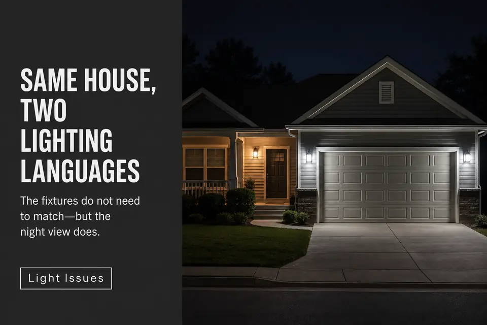
Porch and garage fixtures can look coordinated in daylight yet separate into two competing lighting systems after dark. One may appear warmer, larger, brighter, or more decorative—even when the housings share a finish or come from the same collection.
The first fix should not be buying another matched set. “Matching” at night is determined by the variable the eye notices first, and fixture style is often not that variable. A bright garage can make compatible sconces seem oversized. Tinted porch glass can make identical lamps appear different in color. Two garage fixtures can collectively outweigh one larger porch lantern.
Treat the porch and garage as one street-facing composition. Observe both after full darkness, isolate color, scale, brightness, and style in that order, then correct the dominant mismatch first. The useful result is not perfect sameness. It is an entry that remains readable, a garage that stays supportive, and fixtures that appear deliberately related.
Color Clash
Test perceived color before assuming the fixtures themselves conflict. A warm porch beside cooler garage lights divides the elevation into separate visual territories: the porch feels amber and residential while the garage appears pale, bluish, or more commercial.
Do not rely solely on the Kelvin values printed on the lamps. Two sources carrying the same color-temperature label can still look different because of LED consistency, lamp age, glass tint, and fixture construction. Surrounding materials also shift the result. Warm brick reinforces amber tones, while white siding or a pale garage door can make the same nominal light appear cleaner and cooler.
Clear glass exposes more of a lamp’s direct color. Seeded, frosted, or amber-tinted glass modifies that color before it reaches the viewer. A recessed porch also contains warm reflected light, while garage sconces on an open wall may appear more neutral. Understanding how 2700K behaves outdoors after dark is therefore more useful than assuming one printed number guarantees an exact visual match.
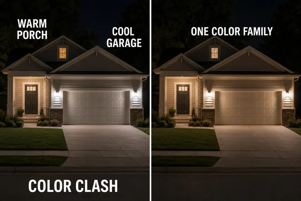
Temporarily exclude unrelated landscape and facade lights from the test. View the porch and garage together rather than standing beneath either fixture.
If the color split remains obvious while output feels reasonably balanced, color is the first variable to correct. Close visual agreement matters more here than a laboratory-perfect numerical match.
Scale Mismatch
Judge scale by nighttime visual weight, not housing dimensions alone. A small sconce beside a wide two-car garage door can disappear against that broad plane. The same housing on a narrow recessed porch wall may feel substantial because it occupies more of the available space.
Repetition changes the comparison. Two garage sconces carry more collective weight than one porch fixture, especially when all three lamps are directly visible. From the curb, the eye reads the illuminated pair as a group rather than comparing each garage fixture individually with the porch light.
Viewing distance matters too. A fixture that looks properly proportioned from six feet away may become insignificant from the street, where the whole elevation is visible. Conversely, a large clear-glass porch lantern may look heavier at night than its physical size suggests because the entire lamp becomes a bright object.
Do not solve this with a universal fixture-to-door ratio. The porch and garage occupy different architectural conditions and do not require identical dimensions. Their luminous weight should feel related from the intended viewing position without either zone overwhelming the other.
Brightness Gap
Reduce dominance before adding light to the weaker zone. Brightness is the mismatch most likely to impersonate a size or style problem: when the garage controls the view, its fixtures appear larger, more important, and less compatible with the porch.
Equal wattage or lumen labels do not guarantee equal visible brightness. A pale garage door returns considerable light toward the street, while a recessed porch absorbs and contains it.
Clear glass and exposed lamps also create stronger luminous points than shielded or frosted sources. These conditions help explain why outdoor lights can look too bright or too weak despite comparable specifications.
The common mistake is to brighten the porch until it competes. That may make the door more noticeable, but it also raises overall brightness and can flatten the front elevation. Temporarily reduce the garage output first. If the fixtures suddenly appear coordinated, their design was never the primary problem.

Test lower output, temporary dimming, better shielding, or reduced direct lamp visibility before increasing illumination elsewhere. The garage must remain usable, but usability does not require it to become the brightest object on the house.
Fixture Style Conflict
Call it a style conflict only if the fixtures still feel unrelated after color and brightness are controlled. A genuine conflict might pair an ornate traditional porch lantern with extremely minimal garage cylinders, or heavy framed fixtures with delicate forms that nearly disappear.
Look for one shared visual cue instead of demanding identical housings. Finish, glass character, line weight, geometric language, and lamp visibility can each create continuity. A compact porch lantern and larger garage sconces can feel related when they share restrained rectangular framing and similar glass. Different shapes can also work when their finish and luminous weight connect them.
Daylight style agreement cannot rescue a severe nighttime color or brightness split. Conversely, fixtures from different collections need not conflict if their illuminated appearance is calm and connected. “Related, not identical” is the practical standard. Replacement becomes sensible only when the design languages still compete after the more influential variables have been isolated.
Front Balance
Recombine the four variables by deciding which zone should lead. The garage may occupy most of the facade’s physical width, but it should not automatically become the visual destination. The entry needs enough presence to remain the obvious place for a visitor to approach.
That relationship belongs to the broader front-lighting hierarchy: the garage remains functional and supportive while the porch communicates arrival. Coordination fails when the garage becomes a bright foreground object and the front door recedes into an unrelated pocket of light.
One intentional difference can improve the composition. A slightly more substantial porch fixture may mark the destination while simpler garage lights serve the wider wall quietly. Equal output, identical dimensions, and perfect symmetry are unnecessary when the hierarchy remains clear.
Change the strongest mismatch variable and reassess before correcting another. A warmer garage lamp, less visible glare, or restrained garage output may also resolve the apparent scale or style conflict. If every front surface still advances as one bright plane, the deeper problem may be why an evenly bright facade can lose depth rather than fixture coordination.
Night View Test
Make the final decision from the position where the mismatch actually matters: the street or normal driveway approach after full darkness. Dusk can conceal an output gap because residual daylight keeps the porch, garage door, and facade readable.
First, observe both zones together without studying individual fixture details. Identify what attracts the eye first: color, luminous size, direct glare, decorative form, or the illuminated garage plane. Then temporarily reduce or switch off one zone where practical. If the remaining area suddenly looks appropriate, the issue is relative dominance rather than an inherently unsuitable fixture.
Change one variable and return to the same viewing position. A phone photograph can provide a useful before-and-after reference, but automatic exposure may deepen porch shadows or exaggerate bright garage lamps. Let the photograph document the test, not determine the verdict.
The correction is complete when the entry reads as the destination, the garage remains useful but secondary, and the fixtures feel related without being identical. Once those three conditions are present, further equalizing can remove hierarchy rather than improve coordination.
For a technical explanation of warm and cool lamp appearance, see the U.S. Department of Energy’s guidance on light-bulb color characteristics.