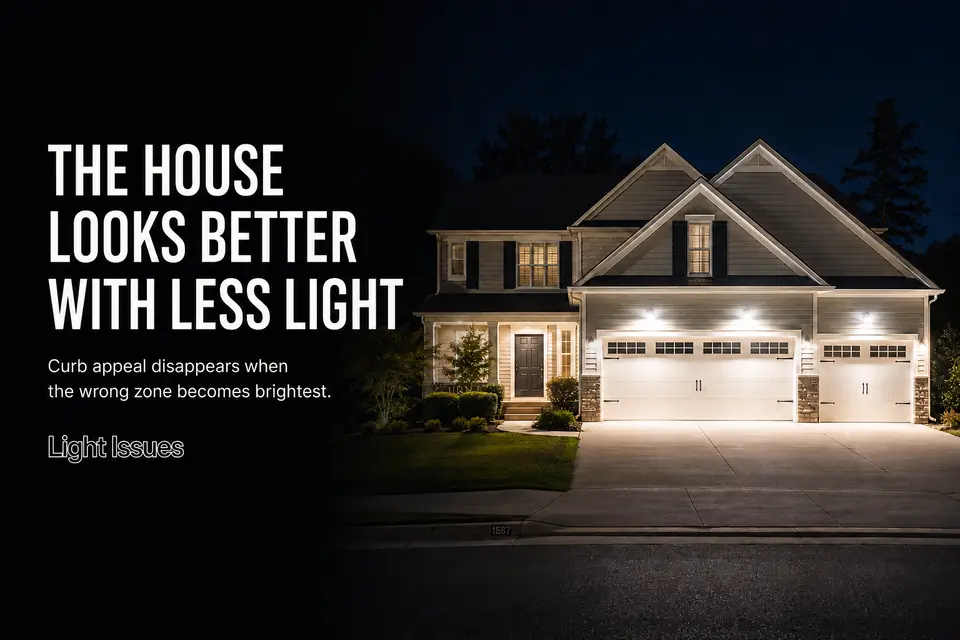
A maintained home can look less appealing the moment its exterior lights turn on. The driveway is visible and the fixtures work, yet the garage commands attention, the front door recedes, or the entire facade becomes a bright, flat surface.
The mistake is treating this as a shortage of light. Nighttime curb appeal is controlled by hierarchy: whichever zone appears brightest from the street becomes the visual priority, whether or not it deserves that role. Adding more light elsewhere usually creates competition instead of balance.
Make the first assessment from the curb, driveway entrance, or opposite sidewalk with every normal exterior light operating. Identify where your eye lands first, then check whether the entry is recognizable and whether the house still shows depth.
A balanced front does not illuminate every surface equally. It lets the entry lead, keeps the garage functional but secondary, and preserves enough shadow to reveal the architecture.
Too Bright From the Street
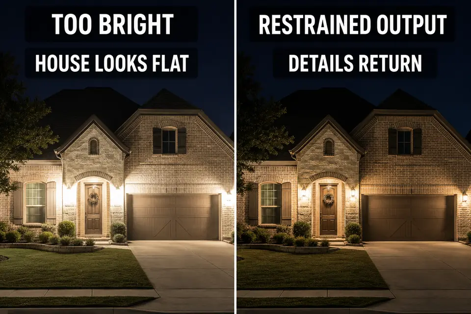
Judge excessive brightness by what controls your attention, not by whether a fixture produces enough light. A lamp can illuminate its assigned surface while its exposed lens becomes the only thing clearly visible from the street.
Standing beneath the fixture hides this problem. From the curb, the source may appear as a concentrated white point surrounded by darker-looking architecture. Brick texture, trim, planting, and even a moderately lit doorway can disappear because your eyes adapt to the brightest object in the view.
Increasing nearby output is the common wrong fix. It raises the total brightness without removing the source that disrupted the composition.
Look at the house from a normal arrival angle. If your eye repeatedly lands on a bare lamp, clear lens, or concentrated hot spot, visible fixture glare is controlling the street view. The stronger first move is to dim, shield, or redirect that source. Once it stops dominating, details that seemed underlit may become visible without another fixture.
Mixed Color Temperatures
Test color consistency from one viewing position, not by comparing individual bulbs up close. A warm porch beside a cold-white garage and a bluish path can divide one facade into unrelated pieces even when each zone works adequately by itself.
This does not require every lamp to carry the same labeled color temperature. Exterior materials change the apparent result. Red brick strengthens warm tones, pale siding reflects cooler light aggressively, and glass or metal can make nearby sources look sharper. Two lamps with similar specifications may therefore look different after installation.
The practical question is whether the entry, garage, path, and architectural lighting appear to belong to the same composition. A deliberate variation can emphasize a material or feature. One isolated cold-white zone surrounded by warmer light usually looks accidental.
Correct the obvious outlier before replacing every lamp. Guidance on restrained 2700K outdoor lighting can help with the warmer end of the range, but curb appeal depends on the visible relationship among zones—not a universal number applied without regard to the house.
Harsh Garage Area
If the garage is the first architectural element you notice, it is doing more than lighting the driveway. Large doors, pale finishes, reflective windows, and paired fixtures make this zone unusually capable of overpowering a smaller or recessed entry.
Broad output may improve pavement visibility while creating hard bands beneath the eaves and deep shadows around door panels. Parked vehicles can add bright reflections that strengthen the garage’s dominance. The result is a house that visually leads with its service area.
Separate useful driveway light from unnecessary garage emphasis. Can you read the pavement transition without making the whole door the brightest surface? Do the fixtures illuminate the approach, or do they mostly expose their own lamps?
Detailed garage-light shadow patterns may require a closer diagnosis, but the curb-appeal correction begins with hierarchy. Reduce the garage’s visual authority through restrained output, shielding, or better aim before brightening the entry to compete with it.
Dark Entry Problem
A dark-looking entry is often a contrast failure rather than a lack of total light. The garage, driveway, or exposed porch lamp can be so dominant that the door and landing disappear even when they receive moderate illumination.
The front door should be identifiable from the street and remain readable during the approach. That requires a connected view of the door surface, landing, steps, and immediate arrival route—not a bright point beside an otherwise shadowed opening.
An unshielded wall fixture can make this worse. Its lens catches the eye while the threshold, handle, or recessed door face remains difficult to see. Installing a higher-output lamp then intensifies the source without clarifying the entry.
After restraining the garage, check where the entry light actually lands. If the landing or approach remains unclear, the narrower diagnosis of front-door lighting that still does not feel safe can guide the next check. For curb appeal, the goal is quieter: the entry should lead because it is legible, not because it is dramatically brighter than the rest of the house.

Flat Facade
Use shadow as a diagnostic tool. If columns, recesses, trim changes, and material transitions disappear after the lights turn on, the facade has been illuminated as an area rather than revealed as a three-dimensional structure.
One broad source can make the entire front equally visible while removing the depth that gives the house character. Recesses become shallow, projections lose definition, and brick, stone, or siding appears less textured.
The correction is not dramatic contrast. Modest changes in brightness are enough to separate a column from a wall or distinguish a recessed entry from the main plane. A secondary layer should reveal a selected surface or transition rather than wash every square foot.
This is also why wall lights can flatten exterior surfaces despite being correctly mounted. When the distribution is too broad or uniform, the fixture shows area but not form. If the house reads as one bright rectangle from the curb, more wall light will reinforce the problem.
Better Front Balance
Balance the facade in order of visual dominance, not fixture type. Wait until all normal dusk controls, timers, and motion settings have reached their usual state, then return to the same street-view position used for the first assessment.
Identify the first place your eye lands. If it is an exposed lamp, a white garage door, or an isolated cool patch, correct that distraction first. Then confirm that the front door is recognizable without making it dramatically brighter than every surrounding surface.
Keep the garage useful but subordinate. Check that color differences appear intentional and that walls, recesses, columns, and materials retain modest brightness transitions. Those transitions preserve depth without making the property feel dark.
Change only one variable before repeating the street-view test. Lowering one dominant source may restore both the entry and the facade. Adjusting several zones simultaneously hides which change improved the composition and often leads to unnecessary additions.
The finished front should have an obvious visual order: entry first, architecture second, garage and route lighting in support. That is the useful curb-appeal test. When those roles are clear, the home often looks more welcoming with less total light.
For a manufacturer-neutral framework covering useful, targeted, low-level, controlled, and warm-colored exterior illumination, see DarkSky International’s Five Principles for Responsible Outdoor Lighting.